Cargill.com
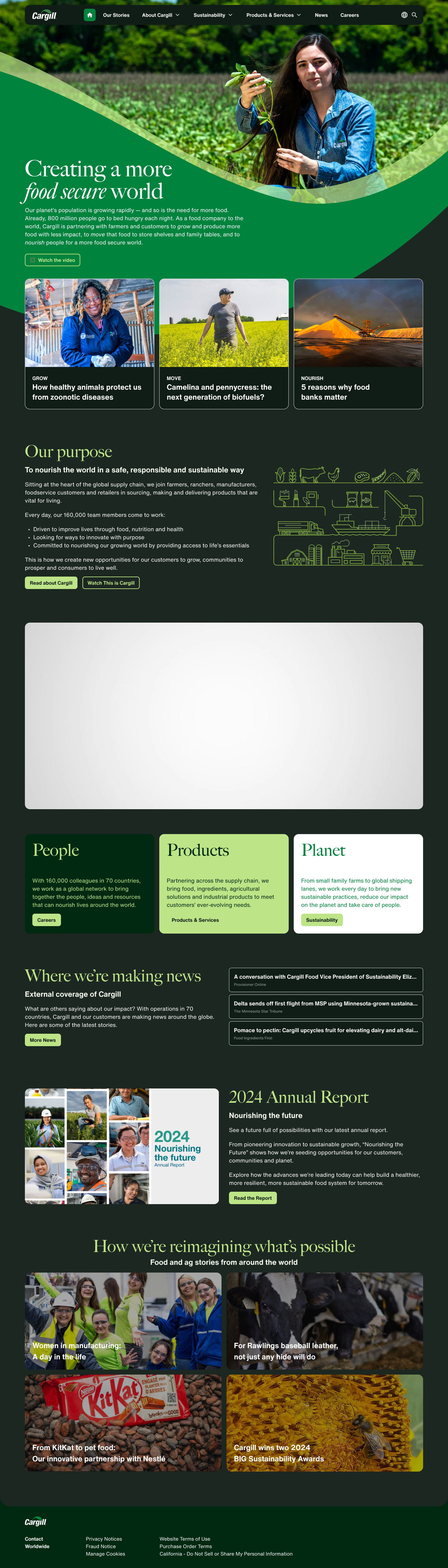
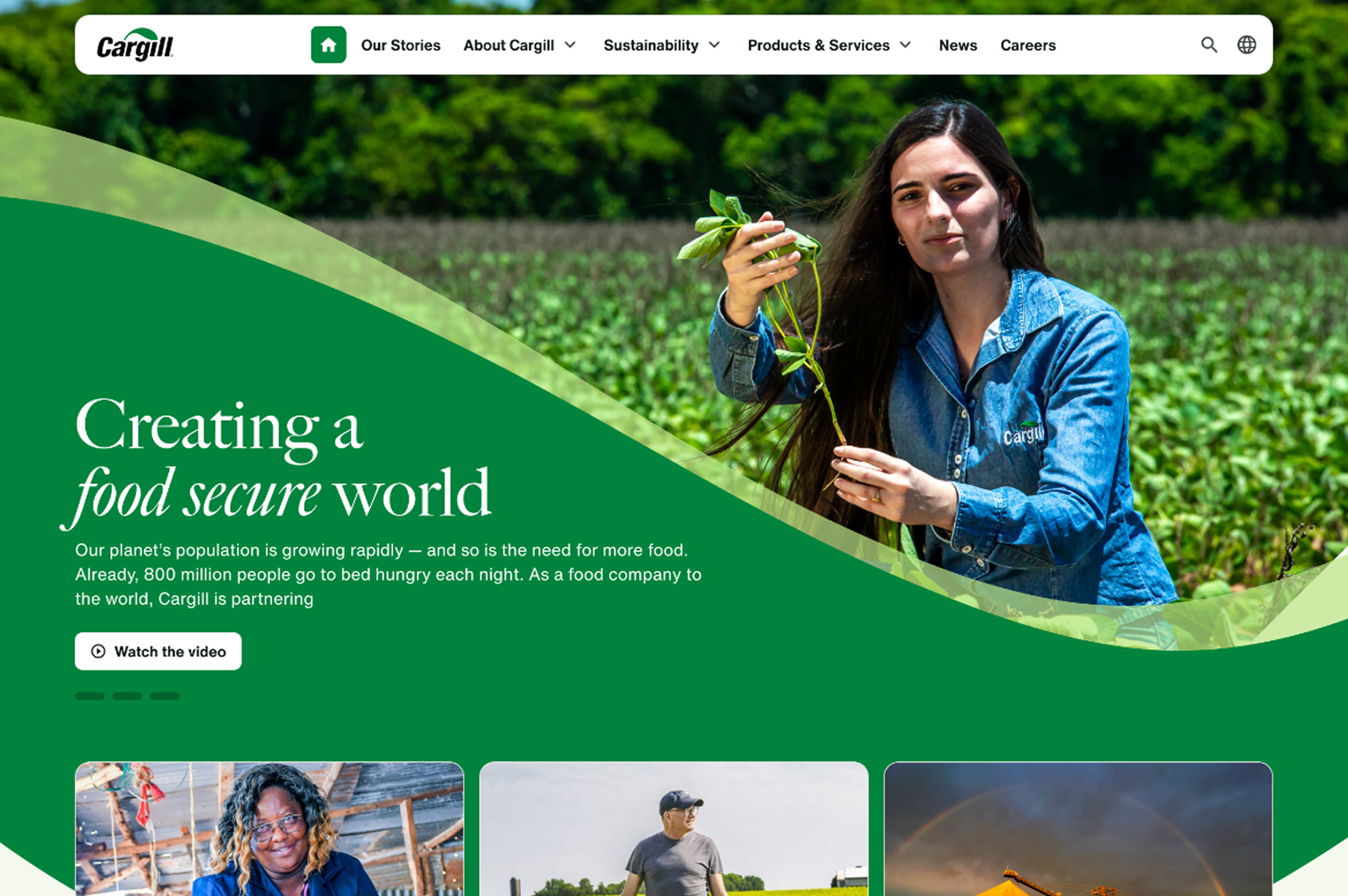
Our planet’s population is growing rapidly — and so is the need for more food. Already, 800 million people go to bed hungry each night. As a food company to the world, Cargill is partnering with farmers and customers to grow and produce more food with less impact, to move that food to store shelves and family tables, and to nourish people for a more food secure world.
Overview
In September 2024, Cargill’s Global Communications team engaged the DT&D Design Team to redesign the Cargill.com homepage in advance of a major brand refresh launching October 8. The goal was to quickly deliver a homepage that reflected the new visual identity, activated the Food Secure World campaign, and improved engagement—without disrupting existing site architecture.
As design lead, I oversaw the experience strategy, design execution, and cross-functional collaboration required to deliver a high-visibility public launch on a compressed timeline.
The Challenge
The engagement came with several constraints:
Extremely tight timeline tied to a fixed brand launch date
A need to reflect new typography, color, imagery, and iconography
A homepage that could support campaign storytelling, not just navigation
No appetite for large-scale information architecture changes
Multiple stakeholder groups reviewing and socializing work in parallel
Success required speed without sacrificing quality or brand integrity.
Goals of the Redesign
1. Brand Alignment
Align the homepage with Cargill’s refreshed brand guidelines
Confidently introduce new typography, color usage, and imagery
Showcase the brand in a modern, welcoming, and innovative way
2. Campaign Activation
Launch the Food Secure World campaign prominently
Use imagery and copy to clearly communicate Cargill’s purpose
Create a flexible hero pattern capable of supporting future campaigns
My Role & Responsibilities
Led the experience and visual design of the homepage
Set direction for:
Content hierarchy
Visual emphasis
Responsive behavior
Leveraged Sprout, Cargill’s enterprise design system, to accelerate delivery
Facilitated live stakeholder reviews and rapid iteration
Partnered closely with engineering to ensure build fidelity
Championed user feedback as part of a compressed delivery cycle
Process
Rapid Design Using the Design System
Given the timeline, we moved quickly from light sketching to high-fidelity design. By relying on Sprout components, the team produced an initial homepage design within three days—a speed that would not have been possible without a mature design system.
Stakeholder Collaboration in Real Time
To maintain momentum:
We presented early designs to internal stakeholders
Used Figma Auto Layout to adjust hierarchy and layout live during reviews
Enabled stakeholders to see cause-and-effect immediately, reducing feedback cycles
Parallel Iteration with Figma Branching
While stakeholders socialized designs internally, we used Figma Branching to:
Maintain a stable review version
Continue iterating in a working file
Avoid losing momentum or overwriting approved decisions
This allowed design and feedback to progress in parallel.
Design–Development Partnership
We worked in close partnership with engineering:
Held daily check-ins during development
Used Figma Dev Mode to communicate specs and intent clearly
Resolved visual and responsive nuances collaboratively
This tight loop ensured what shipped matched the design vision.
User Testing Under Time Pressure
After initial stakeholder and leadership feedback, we validated the design with users:
Conducted unmoderated testing via Maze
Focused on two primary audiences:
Professionals
Job seekers
Collected rapid, actionable feedback without slowing delivery
Outcomes & Success Metrics
Delivered the redesigned homepage ahead of the October 8 launch
Successfully launched the Food Secure World campaign
Post-launch performance showed:
Improved navigation performance despite unchanged IA
User testing results:
Look and feel: 4.2 / 5
Engagement: 4.5 / 5
Top descriptors: Innovative, Friendly, Welcoming
Challenges & Design Tradeoffs
Designing with the Leaf
The refreshed brand introduced the leaf as a core visual element—iconic, but complex digitally.
Key challenges included:
Content constraints when placing headlines and CTAs inside the leaf
Finding imagery that:
Fit the shape
Scaled responsively
Represented Cargill’s inclusiveness
To address this, we:
Collaborated closely with stakeholders to refine copy
Curated ~30 image options from brand approved imagery to ensure flexibility
Carefully tested compositions across breakpoints
Impact
Demonstrated how a design system enables enterprise-speed execution
Delivered a modern, brand-forward public homepage under real-world constraints
Validated that meaningful UX improvements are possible without structural overhauls
Reinforced trust between design, engineering, and communications teams
Why It Matters
This project illustrates how strong design leadership, paired with a mature design system, enables teams to move fast, collaboratively, and confidently—even on the most visible surfaces of a global brand.
It also validated a broader belief that guides my work today:
Design systems aren’t just about consistency—they’re about speed, trust, and impact.